The Art of Initials - When Letters Become Images
The art of initials is one of the significant achievements of medieval book art. Although the practice of emphasizing the initial letters of text sections had already begun in late antiquity, it was not until medieval illuminators conquered the capital letters as a field for artistic creativity and invention. In the course of the Middle Ages, initials, together with decorated borders and frames, became those places in precious manuscripts where their creators could try out and develop their artistic talents. The occasionally humorous results give witness to a great joy in design and creation. The small works of art, which are often adorned with gold, became a central decorative element of secular and religious books already in the early Middle Ages and fulfilled various functions. And it was particularly in the period of the first printed books that initials became an integral part of the texts.
Just like the script of the body of the text and the miniatures, their forms of course arose from the respective taste of the time and stylistic developments and thus changed over time. However, since there were also many continuities and an inexhaustible variety, you will not find a chronology of the art of initials here, but rather an insight into the creative diversity of forms and types that medieval illuminators produced - from the impressive interlace initials of early book art, through simple lombards and detailed ornamental initials to fantastical zoomorphic and historiated initials.

To the facsimile
Mere decoration?

To the facsimile
Of course, initials are first and foremost decorative ornaments that, like miniatures or borders, underline the value of a text, but should also represent the status and wealth of the patron. In some cases, however, they also function as a pictorial addition to the text, as long as their composition is related to the content. Above all, however, initials serve to structure and hierarchize a text by marking sections and creating clarity. Particularly important sections or the beginning of a new book or chapter, for example, can be highlighted with very large and splendid initials. Subchapters or shorter sections tend to be marked by smaller or plainer initials known as subsidiary initials. Thus, the decorations of initials are often hierarchically graded, as demonstrated by the page from the Oxford Decameron.
Great Art in the Early Middle Ages: Interlace Initials


The insular illumination of the early Middle Ages produced an impressive high point of the art of initials: the interlace initial. Probably their most famous representatives are found in the Lindisfarne Gospels and the Book of Kells. Their name is derived from the delicate interlace that dominates their appearance and often is combined with antique ornaments and zoomorphic, or animal-like, elements. The elaborate ornamental compositions were taken to such an extent that the letters sometimes seem to literally disperse and are barely recognizable - a development that we will observe time and again.
The creative abundance of the insular interlace initials is most remarkable

To the facsimile
In the case of insular interlace initials, however, the creative abundance is particularly remarkable, since we are still in the early days of the art of initials. Not too long before, initials were not even a common principle of layout and order in book art. It is therefore not surprising that Carolingian illuminators liked to adopt the insular models, as the Lorsch Gospels and the Bible of St. Paul Outside the Walls show so marvelously, and that interlace initials can still be found even in the Ottonian Sacramentary of Henry II.

To the facsimile

To the facsimile

To the facsimile

To the facsimile
Experience more
The Roots of the Art of Initials
Late antique texts feature none to few plain initials. Here, colored display script was rather used to mark the beginning of a new section, which was often continued in medieval texts as well. The Vergilius Augusteus, on the other hand, shows the incipient but reticent use of large initials, which nevertheless formed the basis for the growing importance of capital letters in the Middle Ages.

To the facsimile

To the facsimile
Ordering the Text: Sentence Initials and Lombards
Similar to the Vergilius Augusteus, most surviving medieval texts are decorated with rather plain initials. The majority of the textual tradition as a whole was poorly decorated and not illuminated, which saved costs and was also often owed to the text genre. In texts that were mainly decorated with unadorned initials, also referred to as sentence initials, the focus was on order.


In the late Middle Ages, a particularly bulbous letter type developed for this purpose. These initials, known as lombards, also often stand out because of their bold colors, such as in The Willehalm - Wolfram Von Eschenbach. The Nibelungenlied und die Klage shows an ornate refinement of the type, which is characterized by a bicolored and split letter body, which is additionally accompanied by blue double contours.
The lombard is a late medieval, bulbous variation of the sentence initial
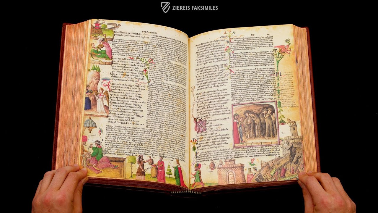
A particularly elaborate and playful variation of the simple sentence initals occurs in the Divina Commedia 1491 Illustrated Incunabulum, to whose small red and green subsidiary initials filigree bouquets of flowers have been "tied".

To the facsimile

To the facsimile
Experience more
Creative Variety: Ornamental Initials
But let us return to the more embellished forms known as decorated initials: They were mostly designed in a purely ornamental, non-figurative manner. Their decoration is based on geometric and vegetal forms. This may sound simple at first, but medieval illuminators produced an almost limitless wealth of variations of this type of initial - sometimes even within a single manuscript, as the Panegyric in Honor of King Robert of Anjou shows.

To the facsimile
An Evergreen of Medieval Book Art: Fleuronnée

To the facsimile
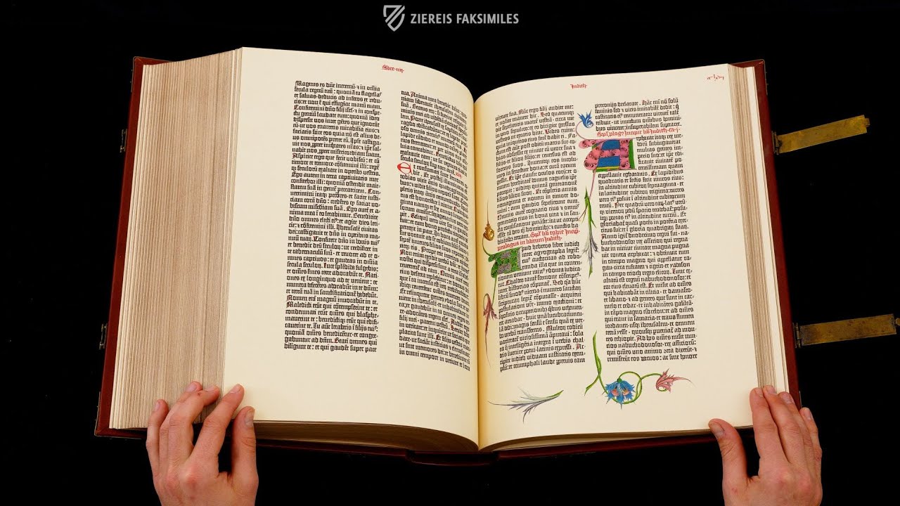
The French term "fleuronnée" refers to an ornament of stylized vegetal and sometimes geometric forms that have been varied in many ways. Since it was mainly drawn with a quill, the correspondinglinear ornamentis also known as penflourish or penwork. As decoration for ornamental initials, it spread rapidly beyond regional and genre boundaries from the 12th century onwards and became one of the most popular and widespread ornaments for the design of subsidiary, but also large initials. Penflourish initials occur in virtually all book genres over the centuries and were typically executed in red and blue. In this context, red penwork usually occupies blue letters and vice versa. The Ambrosian Virgil of Francesco Petrarca, however, contains a fine example of how golden capitals were also sometimes decorated with fleuronnée.
Fleuronnée was one of the most popular ornaments for the illumination of late medieval initials


Experience more
Gold and Lush Colors: Champie Initials

To the facsimile
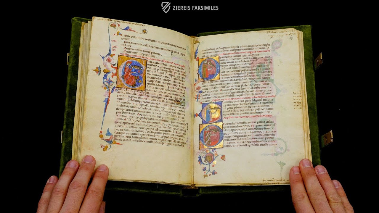
A champie initial is a painted letter - small or large - in a box that serves as a background and frame. These beautiful initials were often decorated in gold, with either the letter or the box shining in gold. Champie initials of plainer forms were usually used as small but still splendid subsidiary initials, though works such as The Codex of Astronomy and Astrology of King Wenceslas prove that it did not have to stop there.

To the facsimile

To the facsimile

To the facsimile

To the facsimile

To the facsimile

To the facsimile

To the facsimile
The Letter as Labyrinth: Initials with Scroll Ornament

To the facsimile

To the facsimile
In many precious manuscripts, fleuronnée or champie initials were combined with a complicated variation of the ornamental initial: the initial with scroll ornament. This general term describes ornamental initials with a dominant vine decoration that either develops around the body of the letter or forms the letter itself. Medieval book illuminators produced the most diverse forms of these complex initials, whose intertwined tendrils sometimes assume labyrinthine proportions - for example, in the Brandenburg Evangeliary and the Antiphonary of St. Peter.


Experience more
Artful Initials from Italy: White Vine Initials

To the facsimile

To the facsimile

To the facsimile
In 11th-century Italy, a special form of the initial with scroll ornament developed that became very popular, especially in regional Renaissance painting: the white vine initial. Here, the book artists only worked out the contours of the often filigree tendrils and left the filling in the parchment or paper tone, so that they stand out in contrast against the multicolored backgrounds, as Christianus Prolianus Astronomia demonstrates particularly beautifully. The letters as such and small details of the ornamentation were also often illuminated with shimmering gold.
The Italian white vine initials captivate with their reduced and at the same time playful aesthetics

To the facsimile

To the facsimile

To the facsimile

To the facsimile

To the facsimile
The Dissolution of the Letter: Initials with Split Stems

To the facsimile

To the facsimile
The interplay of the body of the letter and intertwined vines is taken to the extreme by the sometimes very intricate initials with split stems. As the name already indicates, they are characterized by their split stem (vertical part of the letter), which usually features an ornamental or at least chromatic infilling. Often braces, resembling forged metalwork, hold the split parts in place or even tie them together with some single vines.
This principle can be seen particularly well in the simple 'U' initial in the Nibelungenlied und die Klage: the vertical parts of the letter are split. The infilled ornament consist of small dots against a red background, while four horizontal clasps hold the split body of the letter and the inner vine ornament together.


In many cases, initials with split stems feature additional zoomorphic elements - such as animal heads as a finial at the end of a vine - like, for example, the stunning 'Q' initial in the Codex Aureus Escorialensis, whose tail is adorned with three animal heads.
The interplay of the body of the letter and intertwined vines is taken to the extreme by the sometimes very complex initials with split stems

To the facsimile

To the facsimile

To the facsimile

To the facsimile

To the facsimile

To the facsimile

To the facsimile
Experience more
The Letter as Habitat: Gymnastic Initials

To the facsimile

To the facsimile
A particularly fascinating and often humoristic variation of the initial with scroll ornament are the so-called gymnastic initials. These likewise vine-adorned capital letters are inhabited by animal and/or human figures that are purely decorative, meaning they have no textual reference. As the name implies, these mostly climb around between the tendrils, which sometimes appears quite gymnastic. However, sometimes you have to look very carefully to find all the figures...


Animals Become Letters: Zoomorphic Initials
A zoomorphic initial is one that is at least partially formed from the body of an animal. This can also be merely an animal head or wings. Thereby, the illuminators often made use of the numerous legends and fables about mythical creatures. Another particularly interesting aspect of zoomorphic initials is that not only the letters become small pictorial works, but also animal bodies become shapeable ornaments.

To the facsimile

To the facsimile
Zoomorphic initials often depict mythical mythical beasts such as dragons and hybrid creatures

To the facsimile

To the facsimile

To the facsimile
The earliest forms of this type of initial can already be found in the fish-bird-initials of the Merovingian illumination of the early Middle Ages. However, throughout the medieval period, artists did not lose interest in incorporating animal bodies into the composition of elaborate initials: from somewhat simpler variations in which an animal body forms a letter, such as in the Speyer Pericopes, to complicated compositions in which the individual animals have to be literally searched for. Particularly impressive examples can be found above all in magnificent liturgical manuscripts such as the Gospels of John of Opava, the Brandenburg Evangeliary, or the Gospels of Henry the Lion, for whose rich illumination there were hardly any limits.
Nevertheless, the smaller initials with more subtle zoomorphic elements, for example in the Romance of the Rose of Berthaud d'Achy and in the Cantigas de Santa Maria - El Códice Rico, are also worth a second look.

To the facsimile

To the facsimile


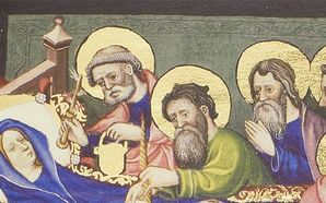
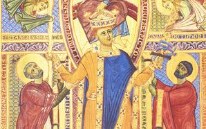
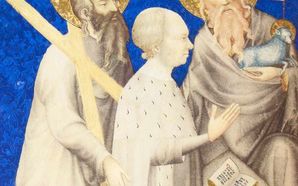
The Merging of Image and Script: Historiated Initials
Probably the most splendid, sophisticated, and appreciated creation of the medieval art of initials is the historiated initial. Here the boundaries between letter and miniature become blurred.
Historiated initials contain figurative representations with textual reference, whereby the letters usually become the frame of the images, which can illustrate individual figures, but also rather complex scenes. In addition, the letters as such are often richly illuminated with ornaments or even zoomorphic elements and decorated with gold - there were hardly any limits to the creative will here, so that the letters became images in every respect!

To the facsimile

To the facsimile

To the facsimile

To the facsimile

To the facsimile

To the facsimile
In the typical case of a clearly recognizable letter body serving as a frame, the latter takes up the figurative representation in its inner compartment. These were often author portraits, but also depictions of saints, rulers and patrons, or even personifications.
However, such initials could also house entire sceneries with several figures in landscapes or interiors, as, for example, the Divina Commedia di San Bernardo admirably demonstrates.

To the facsimile

To the facsimile

To the facsimile


In exceptionally valuable manuscripts, the interplay of image and letter was often taken so far that the initials are hardly recognizable as such and seem to dissolve into the image. In the case of the 'Q' initial in the Goslar Gospels, for example, one might at first think that one is looking at a large pictorial medallion, until realizing that the evangelist Luke is sitting in the inner field of a bright round body of a letter. The so-called tail, i.e. the extension that distinguishes a 'Q' from an 'O', is also only visible at second glance, as it is formed by a green dragon with red wings that is trying to devour a human figure. A support for the viewer are the capital letters on the right side, which only make sense with a 'Q' at the beginning: QUONIAM QUIDEM - the first words of the Gospel of Luke.
In the case of particularly magnificent historiated initials, the letter, image and gold leaf merge to such an extent that the body of the letter can often only be guessed at
The situation is similar with the magnificent historiated P initial in the Divine Comedy of Alfonso of Aragon: especially the luminous golden background, but also the wildly entwining leaves distract the eye from the rather narrow, red body of the letter with filigree white ornamentation, so that one might at first think to be looking at an opulently framed miniature.

To the facsimile

To the facsimile

To the facsimile

To the facsimile
A special variation of the historiated initial are ornamentally and partly zoomorphically designed capital letters that are 'inhabited' by figures referring to the text. Two particularly creative and artistic examples of this can be found in the Bamberg Psalter and the Sacramentary of Metz. While the zoomorphic initial with scroll ornament 'Q' forms the base for Goliath, the initial 'T' even becomes part of the scene depicted and thus functions not only as the first letter of the Te Igitur prayer, but also as the cross of Christ. The latter becomes even clearer when the gaze wanders upwards: the depiction of the sun and moon, personified by Sol and Luna, to the left and right above the crossbar typically belongs to the iconography of Christ's crucifixion.


In some manuscripts, historiated initials make up the majority of the illumination

To the facsimile

To the facsimile

To the facsimile
In some manuscripts, historiated initials even make up the majority of the illumination, which testifies how highly appreciated the art of initials was in the Middle Ages, but also still during the Renaissance. Remarkable examples of this are, among others, the Latin Moamin with its countless falconry scenes in gold-decorated infilled initials, but also the precious Bible of Pietro Cavallini as well as the magnificent Gradual of St. Katharinenthal. Particularly noteworthy is also the Gradual of Gisela von Kerssenbrock, whose pages are truly covered with historiated initials of all sizes, depicting scenes from the life of Christ and Mary.

To the facsimile

To the facsimile

To the facsimile

To the facsimile

To the facsimile

To the facsimile
Experience more
Calligraphic Art: Cadels

To the facsimile

To the facsimile
A completely different form of initials developed in the late Middle Ages: cadels. The term refers to capital letters, usually initials, which were designed in a spacious calligraphic manner from parallel and partially intersecting shafts and arches. A special gem of this type of letter is the Dancing Book of Margaret of Austria. Here, beautiful cadels in bright gold and silver ink stand out against the purple parchment on almost every page. In the Model Book of Calligraphy and in the Tyrolean Fishing Book of Emperor Maximilian, the principle of artistically intersecting lines is excessively developed.


Initialen in frühen Druckwerken

To the facsimile

To the facsimile
With the first printed books (incunabula), there also appeared woodcut and later copperplate initials, which usually resemble ornamental champie initials. However, in very valuable books, such as some surviving Gutenberg Bibles, spaces were left during printing that could later be filled in by hand with painted ornamental initials according to the taste and budget of the patron. This circumstance shows how much initials belonged to book texts at the end of the Middle Ages and could hardly be imagined without them - as a principle of order as well as of decoration.
")
")
")


Experience more
 – Trinity College Library (Dublin, Ireland)")
")
 – Hs. B 4387 – Stadtarchiv Goslar (Goslar, Germany)")
 – K 4984 – Kunsthistorisches Museum (Vienna, Austria)")
")
")
")
")
 and Georg Ziereis (r.) personally present the first numbered copy of the limited edition facsimile of the Gero Codex to Pope Francis. Photo (c) Vatican Media")